
The best restaurant menu board design ideas do three things fast: make the board readable from a distance, guide eyes toward high-margin items, and leave room for value bundles and daypart offers. In 2026, the winning boards are simpler, more visual, and easier to update across in-store and online channels.
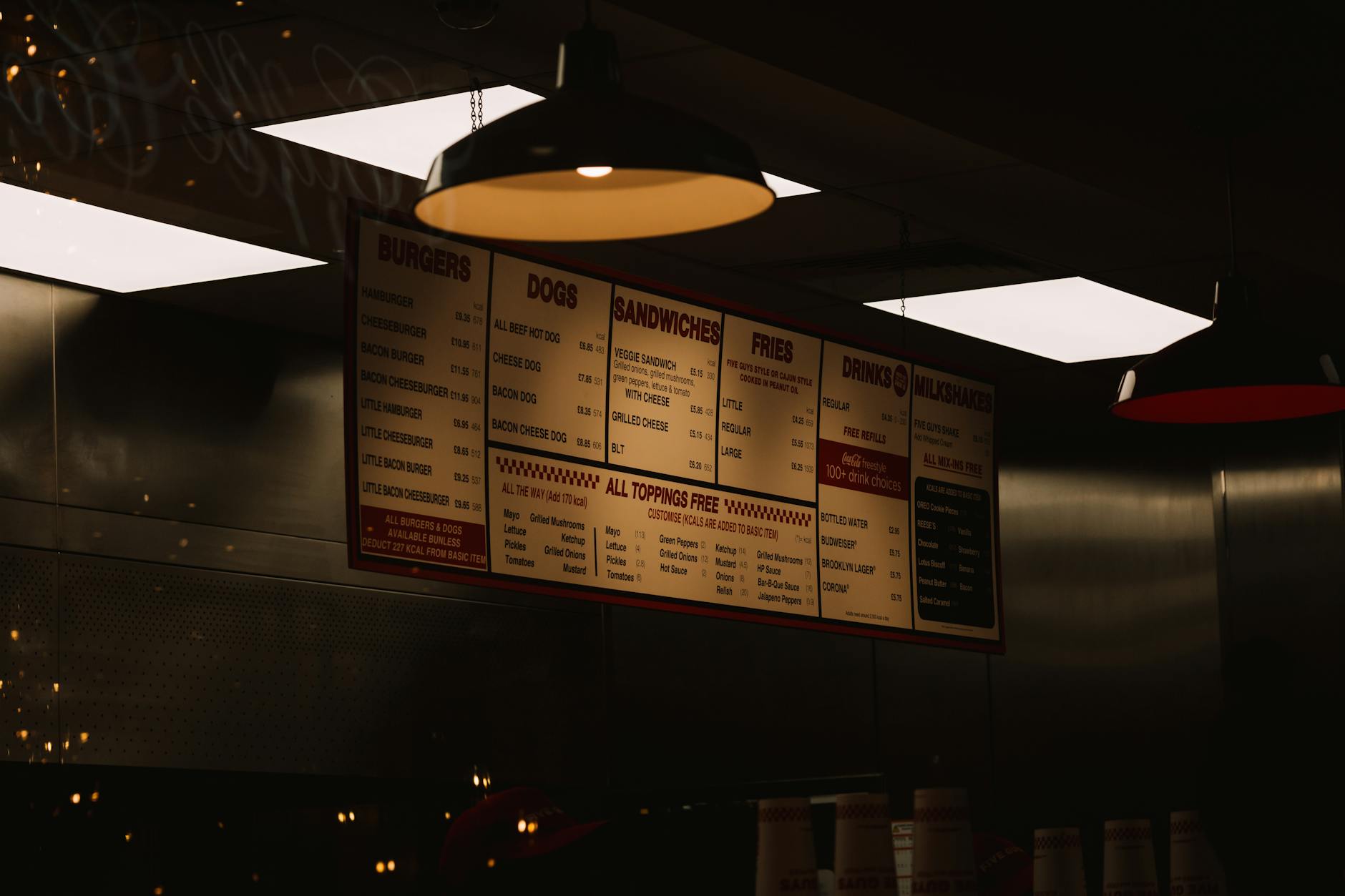
Photo by Joaquin Carfagna / Pexels
Why do menu boards need to sell faster in 2026?
Popmenu's 2026 restaurant trends study says 69% of diners are more likely to choose restaurants with value meals and discounts, while 41% expect technology to make the experience faster and more informed. Your board is no longer just signage; it is a value message and a speed tool. (Popmenu, 2026)
Guests want better value, but they also want less friction. Your board has to shorten the path from "What should I get?" to "I'll take that."
This matters even more for dine-in brands. The National Restaurant Association reports that 64% of full-service guests and 47% of limited-service guests say the experience matters more than the meal price. If customers should feel your concept is organized and trustworthy, the menu board is one of the first proofs. (National Restaurant Association, 2025)
For operators improving guest flow, the board belongs inside the broader restaurant experience system, not in a disconnected design file.
What does a high-converting menu board layout look like?
A 2026 peer-reviewed study of 448 restaurant patrons found visual appeal was the strongest design-related predictor of loyalty among the variables measured, and Popmenu reports 29% of consumers are more likely to choose restaurants that feature photos and reviews on the menu. Layout affects confidence, not just looks. (Innovative Marketing, 2026; Popmenu, 2026)
The strongest layouts share three traits:
- One obvious category path
- One visual priority item or bundle per panel
- One consistent price treatment
Start with the customer decision path, not the canvas. Which categories do people choose first? Which items carry the best margin? Which add-ons attach most often? Put those in the zones people see first.
In most landscape boards, that means best sellers and bundles near the center, with supporting categories around them. Avoid giving every item equal weight. Equal emphasis kills momentum.
If you need a faster starting point, build on a reusable structure. Visora's template library helps keep hierarchy stable even when prices and promotions change.
How many items should you show before the board feels crowded?
The National Restaurant Association ranked "smaller or streamlined menus" as the #3 macro trend in its What's Hot 2025 forecast, while 47% of operators say they plan to add new discounts, deals, or value promotions. The implication is simple: clutter the core menu less so promotions have room to work. (What's Hot 2025; State of the Restaurant Industry 2025)
Most boards underperform because they try to answer every edge case on the main screen. That shrinks type and makes bundles impossible to feature.
Three better design ideas:
- Keep the hero board focused on the items that drive most orders.
- Move low-frequency variants into a secondary panel, QR menu, or counter handout.
- Group modifiers instead of repeating them under every item.
If you run breakfast through dinner, use separate daypart layouts with the same grid so the brand still feels familiar.
As a rough rule, if a first-time guest cannot identify categories, lead items, and price ranges in five seconds, the board is already too busy.
Design idea: use anchors, bundles, and decoy pricing
Nearly 75% of all restaurant traffic now happens off-premises, and the National Restaurant Association says 67% of consumers are interested in bundled meals from restaurants. Meanwhile, Toast's 2026 price monitor shows burger prices and coffee prices continue to rise year over year, which makes visible value framing even more important. (Off-Premises Trends 2025; Toast Menu Price Monitor)
Use price anchors intentionally:
- Put premium items first so mid-tier items feel more accessible.
- Show meal bundles beside single items, not on a separate forgotten panel.
- Use one "trade-up" option in each category, such as combo, large size, or signature protein.
You do not need gimmicks. You need contrast. When the board clearly shows "single item" versus "meal" versus "premium add-on," customers compare within the structure you built.
Give bundles their own background block or framed container so they do not compete on equal terms with every standalone item.
Need a menu board system that is easier to update by daypart and promotion? Visora helps restaurant teams reuse restaurant templates, keep screens consistent, and push changes without rebuilding the layout each week. See pricing.
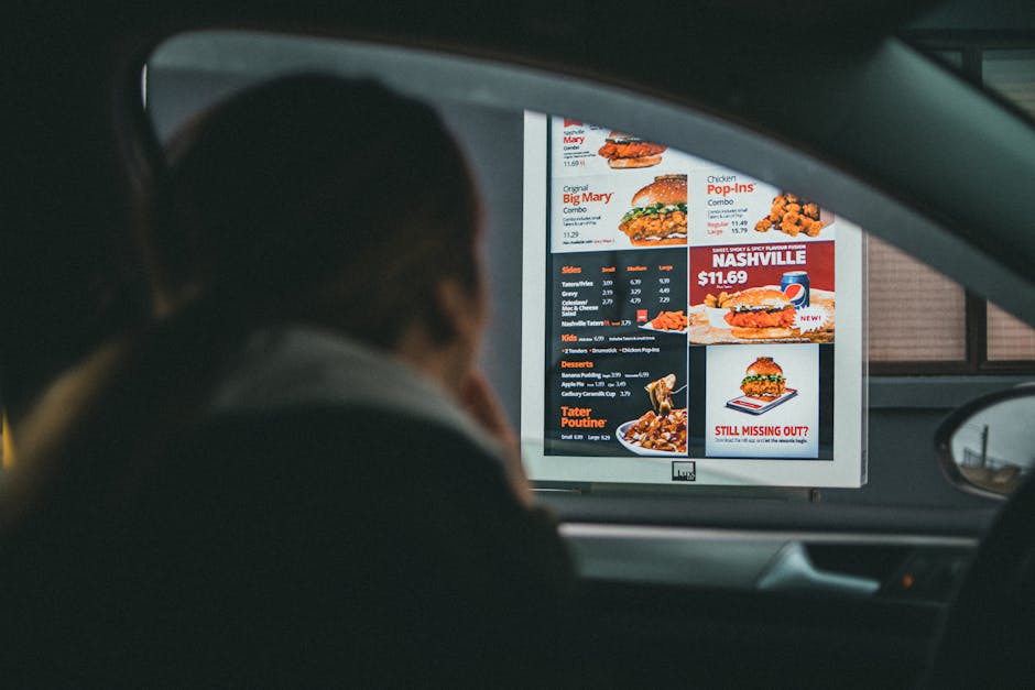
Photo by Jonathan Cooper / Pexels
Where should photos go so they increase orders instead of slowing the line?
Popmenu reports 29% of consumers are more likely to choose restaurants that feature photos and reviews on the menu, while the 2026 peer-reviewed digital menu study found visual appeal had the strongest positive relationship with loyalty among the measured design variables. Photos help most when they support choice, not when they flood the screen. (Popmenu, 2026; Innovative Marketing, 2026)
Use photos for:
- Signature dishes
- High-margin items
- New seasonal launches
- Bundle or combo offers
Do not use photos for every category and every size variant. Once everything has a photo, nothing has priority.
One hero image per panel, or one image per category block, is usually enough. For customizable items like bowls or pizzas, feature the most common finished build rather than every ingredient option.
For multi-location brands, keep photo standards documented.
How can you design for breakfast, lunch, dinner, and limited-time offers?
Square reports 78% of restaurant owners say online ordering is the channel that drives the most orders, and Toast's 2026 pricing data shows core items continue moving upward year over year. Static boards break under that kind of operational change. Dayparted boards age better because they separate message, offer, and price by service window. (Square, 2025; Toast Menu Price Monitor)
Designing for dayparts means planning fixed zones:
- A top zone for categories
- A center zone for hero items
- A lower or side zone for promos and add-ons
When the structure stays fixed, switching from breakfast tacos to lunch combos does not confuse staff or guests.
Reserve one area for rotating offers so seasonal launches do not force a full redesign. The same principle applies to drive-thru, pickup, and dine-in boards: consistency does not mean identical layouts, only consistent categories, naming, and bundle logic.
Design idea: build one system for in-store screens, online menus, and promotions
Square says first-party online ordering delivers profit margins that are 64% higher than third-party delivery, and 32% of consumers in Popmenu's 2026 study say direct online ordering makes them more likely to choose a restaurant. Your board should reinforce the direct channel, not fight it. (Square, 2025; Popmenu, 2026)
Too many restaurants run three disconnected systems:
- A menu board for the counter
- A different structure online
- A third structure inside promotions or social ads
That creates slow updates, pricing mismatches, and missed upsells.
Define one menu architecture:
- Core categories
- Hero items
- Bundle logic
- Modifier logic
- Promo slots
Then reuse it everywhere. Your in-store board stays concise, your online menu handles the longer tail, and your ads can point to the same names and bundles customers already saw on-screen.
Restaurants that treat digital signage as part of their operating stack usually move faster. The same structure that helps guests order faster also helps operators update faster.
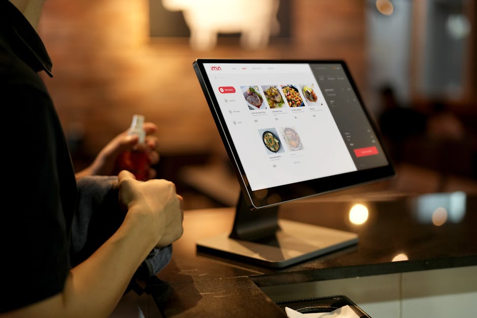
Photo by iMin Technology / Pexels
How do you turn these design ideas into a repeatable weekly workflow?
The National Restaurant Association says 90% of fine dining operators and 87% of casual dining operators see on-premises business as more important to success than greater off-premises business, while 47% of operators plan new value promotions. The board therefore has to stay fresh without becoming unstable. (National Restaurant Association, 2025; State of the Restaurant Industry 2025)
The simplest weekly workflow looks like this:
- Review sales by category, bundle, and add-on.
- Choose one hero item and one value message per daypart.
- Update only the promo zone and any price-sensitive blocks.
- Check that your top-margin items still sit in primary positions.
- Verify that counter, online, and promo menus match.
If you are rebuilding more than two or three zones every time something changes, the issue is probably not your staff. It is your system. Stable templates, clear ownership, and a fixed content map reduce menu chaos fast. Keeping the board tied to your restaurant setup and reusable template system keeps the design operational.
Frequently Asked Questions
Nearly 75% of restaurant traffic now happens off-premises, and Square says 78% of restaurant owners view online ordering as their main order-driving channel. Most menu-board questions now sit at the overlap of in-store readability, online consistency, and fast updates. (National Restaurant Association, 2025; Square, 2025)
What makes a restaurant menu board sell better?
A strong board is easy to scan, puts high-margin items in the most visible positions, and gives bundles or premium add-ons a distinct visual treatment. The goal is not to show everything. The goal is to guide the fastest possible decision without making the board feel cheap or chaotic.
How many items should a restaurant put on one menu board?
Show only the items guests can realistically compare in a few seconds. Keep the primary categories and best sellers on the main board, then move edge-case items, long modifier lists, or specialty variants into secondary screens or QR-linked menus. If the type must shrink to fit, the board already has too much on it.
Do menu board photos increase sales?
Usually yes, but only when you use them with restraint. Photos work best for signature dishes, bundles, or new items that need visual appetite appeal. When every item has a photo, customers lose the visual cue that tells them what to consider first.
Should prices end in .99 on restaurant menu boards?
Only if that supports the brand and still scans cleanly on-screen. Many quick-service boards convert better with cleaner whole-dollar or simplified price styling because it reduces visual friction. Choose the format that is easiest to read from the farthest ordering point.
How do digital menu boards help with price changes?
They let you update one content system instead of redesigning or reprinting the full board. That matters when ingredient prices move, limited-time offers rotate, or breakfast and lunch menus change on the same screen. A modular layout makes those updates faster and less error-prone.
What size text should restaurant menu boards use?
There is no universal point size, because the right answer depends on viewing distance and screen placement. What matters is contrast, hierarchy, and restraint. Fewer font weights, larger category headers, and predictable spacing usually outperform decorative typography.
How often should a restaurant redesign its menu board?
Keep the system stable and refresh the selling layer more often. Most restaurants benefit from quarterly layout reviews and much more frequent promo updates. If you are redesigning the full board every month, you likely need a better template structure.
Want a menu board that is easier to manage across promos, dayparts, and multiple screens? Start with Visora's templates, connect your workflow to the core restaurant setup, and compare plans on pricing.